Stock Market Update
The stock market is experiencing a short-term pullback within a longer-term uptrend. I wrote about this dynamic in my last update: Is There Any More Pull To The Pullback In Stocks.
Long-term the market continues to look bullish. Short-term market internals have improved to a degree that suggests the pullback in stocks may have ended and odds now favor market strength in the near-term.
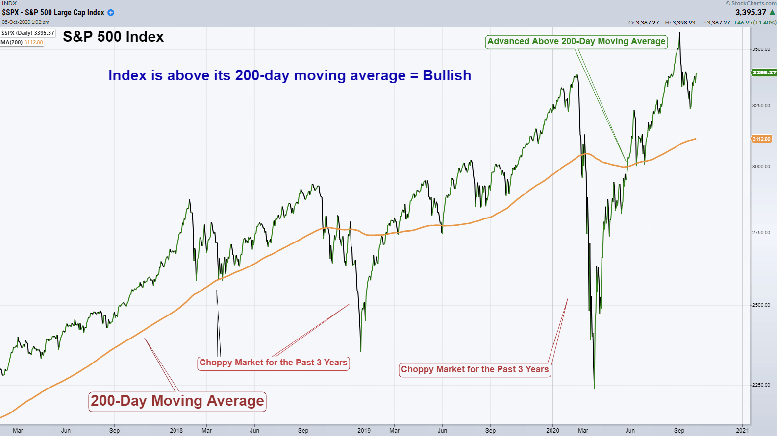
A Long-Term View
Since the beginning of 2018, the market has been very choppy. In the chart below, notice how coming into 2018 the S&P 500 Index was trending up strongly above its 200-day moving average. Then, from January 2018 on, the market has chopped dramatically above and below its 200-day moving average.
The 200-day moving average is commonly looked at as the determining factor of whether the market is long-term bullish or bearish. The S&P 500 advanced above it’s 200-day moving average, at the end of May, after having fallen 33% in only four weeks last February.
As long as the index is above this moving average I believe you have to be long-term bullish on the stock market.
Short-Term View
On a shorter-term basis, the market is pulling back from all-time highs. This type of market action is not necessarily something that would suggest a market top. It is perfectly normal for the market to retrace a portion of its previous advance.
That being said, the economy is in recession and feeling the effects of an economy that is being adversely affected by the pandemic. Therefore, being able to use technical analysis to determine market strength and manage risk is paramount.
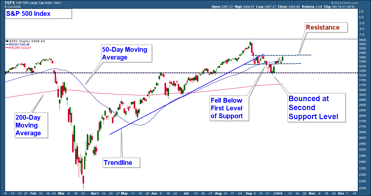
Below is the same S&P 500 Index chart that I highlighted in our last update. I notated three levels of support and the market ended up advancing off the second level.
The daily chart looks bullish. The index bounced at support and is above its 50 and 200-day moving averages. For final confirmation of a new uptrend I am looking for the index to advance above resistance which I have notated.
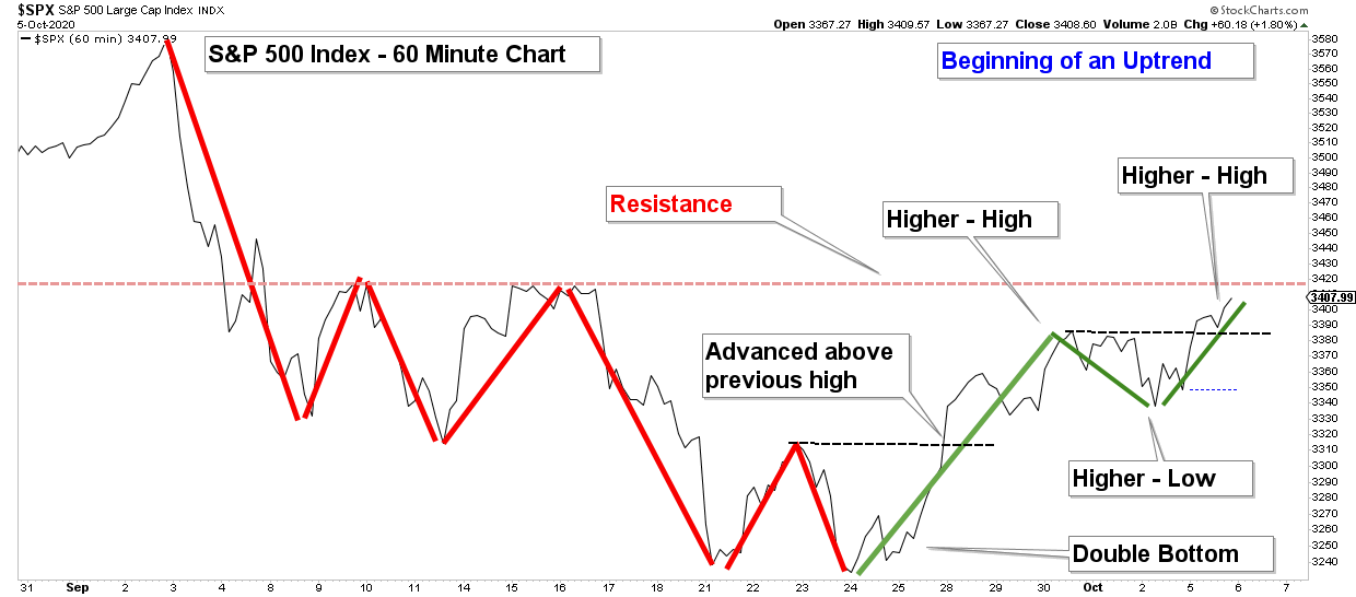
An uptrend is defined by a chart pattern of higher-highs and higher-lows. With this in mind, I like to look at price structure to help me determine the trend of the market.
Below is a 60-minute chart of the S&P 500 going back to the market high at the beginning of September 2020. So, we are just looking at the short-term pullback in the market that has occurred over the past month.
I have annotated the major moves to help you visualize the short-term price structure of the market. The price structure that I view as weak is highlighted in red and the recent advance which is displaying strength is in green.
There is a distinct difference between the price action annotated in red versus green. The red lines highlight how the index was not able to advance above resistance or bounce off support and this creates the downtrend.
The green line has made a higher-low and two higher-highs. This is an uptrend. The next thing to watch for is if the index can advance above resistance created by the highs of last month.
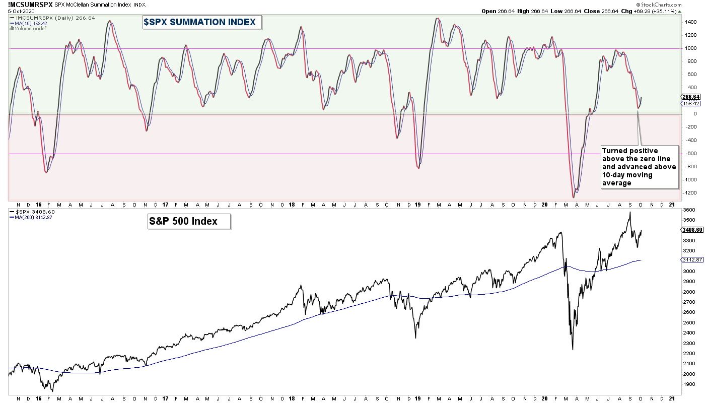
One thing you want to see for an indication that the pullback is over and the market is set to advance higher is an improvement in market breadth. Below is my favorite breadth chart the S&P 500 Summation Index.
There are two things that I look for on this chart. One, is the index below or above the zero line. As a general rule, if the index is below zero market breadth is longer-term weak and caution is advised. And two, I look for moving average crossovers. When the index crosses above its 10-day moving average it suggests short-term breadth has turned positive.
Notice how the index has just crossed above its moving average and is above zero. Market breadth is strongly suggesting that the recent period of weakness has dissipated and odds favor broad stock market strength in the near-term.
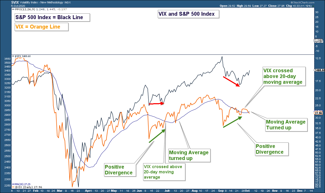
Another chart I am monitoring is the VIX which is a sentiment indicator and commonly referred to as a fear index. Below is a chart of the VIX and I have inverted it to make it easier to compare to the S&P 500 Index.
There are three things I look for when analyzing a chart of the VIX. One, is there a divergence either positive or negative? Two, is the VIX above or below its 20-day moving average? And three, is the moving average trending up or down?
On the far right side of the chart, you can see that the VIX has been positively diverging with the S&P 500, crossed above its moving average and that moving average has just turned up.
It may be a little early, but the VIX is suggesting that the recent pullback in the market may have ended.
The weight of the technical evidence continues to support our bullish longer-term market thesis. With the recent period of improved market strength, the market also looks bullish on a short-term basis.
Client Account Update
The equity exposure in our conservative accounts is at about 43% and aggressive accounts are at 57%. I am looking to increase that allocation in the coming days and weeks provided market technicals continue to display strength.
As always, managing risk is paramount, and protecting our clients from major losses during severe market corrections is our focus.
If you have any questions, please feel free to send me an email.

Craig Thompson, ChFC
Email: [email protected]
Phone: 619-709-0066
Asset Solutions Advisory Services, Inc. is a Fee-Only Registered Investment Advisor specializing in helping the needs of retirees, those nearing retirement, and other investors with similar investment goals.
We are an “active” money manager that looks to generate steady long-term returns, while protecting clients from large losses during major market corrections.
Asset Solutions may discuss and display, charts, graphs, formulas which are not intended to be used by themselves to determine which securities to buy or sell, or when to buy or sell them. Such charts and graphs offer limited information and should not be used on their own to make investment decisions. Most data and charts are provided by www.stockcharts.com.
Asset Solutions is a registered investment adviser. Information presented is for educational purposes only and does not intend to make an offer or solicitation for the sale or purchase of any specific securities, investments, or investment strategies. Investments involve risk and unless otherwise stated, are not guaranteed. Be sure to first consult with a qualified financial adviser and/or tax professional before implementing any strategy discussed herein. Past performance is not indicative of future performance.
All charts provided by: StockCharts.com