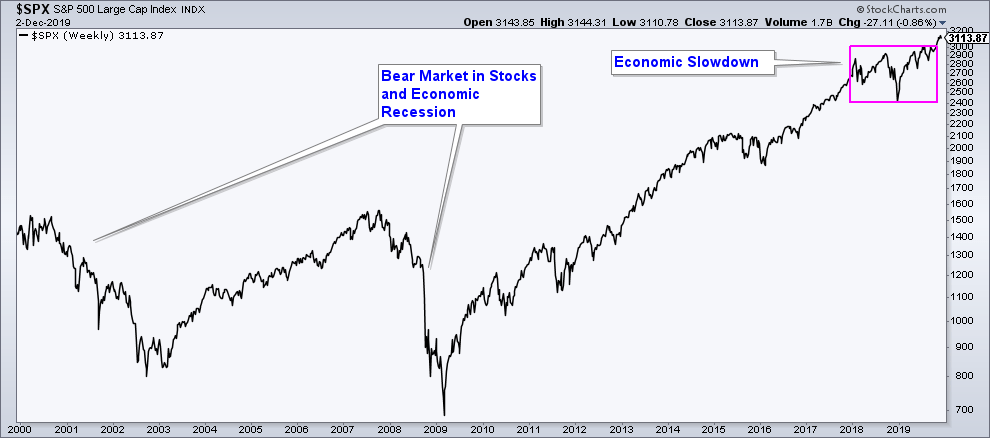
Long-Term Stock Market Summary
On October 28, 2019, the S&P 500 advanced to new all-time highs and above an area of major resistance. This is bullish price action.
Prior to that break to new highs, the stock market had been volatile and not able to make any major gains. The reason for poor stock market performance over such a long period of time is that we were/are in a period of global economic weakness.
Below is a long-term chart of the S&P 500 that includes the past two bear markets that occurred during economic recessions. Of note is the degree to which the market fell when the correction in the market occurs during an economic recession. The pink box highlights the recent choppy market action that has occurred over the past couple of years as a result of the economic slowdown.
The fact that the S&P 500 has advanced out of an area of consolidation and is at new all-time highs suggests that the index is signaling that we are entering a new long-term period of stock market strength; however, let’s look at the internals for confirmation.
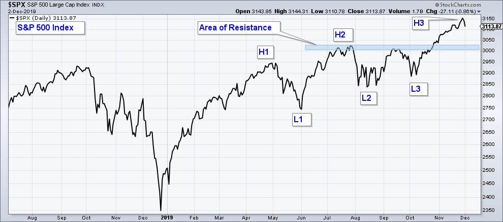
Short-Term Chart of the S&P 500 Index
Below is a shorter-term chart of the S&P 500 Index that highlights the recent stock market breakout to new highs. Notice how the index advanced above resistance and is in an uptrend as defined by higher-highs (H1,H2,H3) and higher-lows (L1,L2,L3).
If we just look at the index, market conditions look bullish. However, we need to look at internals for confirmation and to help us determine broad stock market risk.
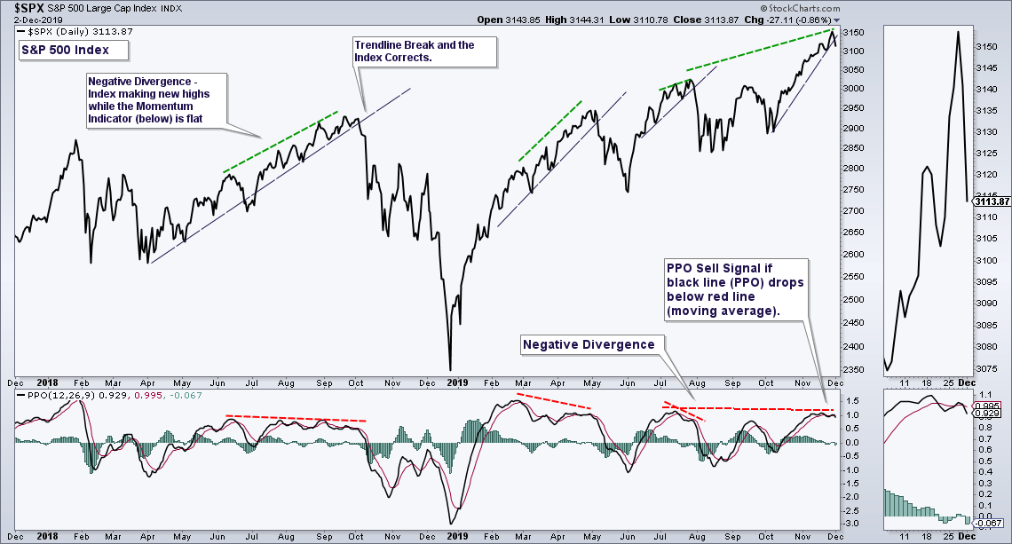
Momentum
Below is a daily chart of the S&P 500 with a momentum indicator (PPO) in the bottom panel. The first thing to notice is that price has advanced higher, however, the PPO has not. This is called a negative divergence and suggests that momentum is not confirming the new high. I have noted the current negative divergence and past divergences with red/green lines. In addition, the momentum indicator has crossed below it’s moving average which is a short-term change in momentum signal.
In summary, momentum is suggesting an elevated risk that the stock market could see a short-term change in trend.
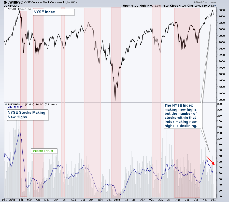
Breadth
Below is a chart of the NYSE Index in the upper panel and the number of stocks within that index hitting new highs in the lower panel, which is a broad stock market breadth indicator. I have the daily readings in light gray with a moving average line in blue. It helps to use a moving average to better visualize the direction of this indicator. When the moving average is falling it means the number of stocks hitting new highs are falling, and vice versa.
I have highlighted those occurrences where the moving average has fallen in red. Notice how historically when this has occurred it has happened during times where the index was falling also. This makes sense in that the number of stocks hitting new highs during pullbacks in the index should be declining. Now notice how the index over the past couple of months has risen, but the number of stocks within that index hitting new highs has fallen. This suggests that the index is hitting new highs, but it is doing so on the back of fewer and fewer stocks.
In summary, market breadth is not confirming the new highs that have occurred in most major market indexes.
Small Cap Stocks
One segment of the stock market that has been underperforming is Small Cap Stocks. Below is a chart of the S&P 500 Small Cap Index. Unlike the S&P 500, it is not at all-time highs and has been trading within a sideways channel for the past year. It did poke its head above the upper end of the channel but fell back below today.
Small-cap stocks are a risk-on asset class and you want to see this index advancing with the broader stock market to confirm market strength.
It would be bullish for the broader market if Small Caps can advance strongly to the upside above this channel. The index is sitting at the top end of this channel so it would not take much for it to rise above this area of resistance.
However, as it stands now, this has not yet occurred so I take this as non-confirmation of the recent highs made by the broader market.

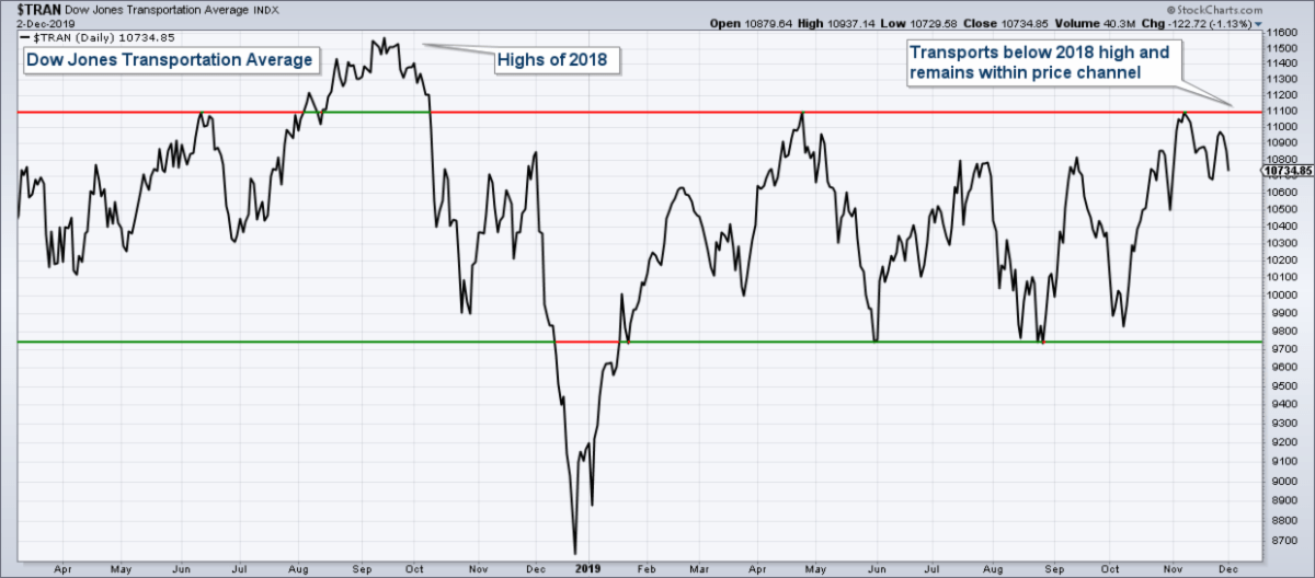
Transportation Stocks
The reason that the Transportation Index (chart below) is important to monitor is that it is very sensitive to economic conditions. Because the stock market has been in a long-term period of consolidation due to poor economic conditions makes this index especially important to track.
When economic activity is robust, transportation stocks typically do well. The fact that they have been underperforming and did not hit new all-time highs like the broader market indexes is another warning signal.
The Transports look similar to Small Caps. They also are at the top of their sideways channel, so it would not take much for the index to break above resistance, which would be bullish. However, this has not happened yet and Transportation stocks continue to under-perform.
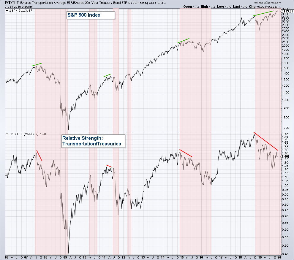
Transportation/Treasury Bond Relative Strength
Another way to chart the performance of the Transportation Index is to chart its performance relative to Treasury Bond Funds which I have posted in the lower panel. The S&P 500 Index is in the upper panel. When the relative strength line (lower panel) is rising this means that Transports are outperforming Treasury Bonds and when it is falling, Treasury Bonds are outperforming.
Usually, during periods of stock market strength/economic strength, you will see Transportation stock outperforming Treasury Bonds, which are the ultimate risk-off asset class. I have highlighted those periods where the relative strength line is falling (Treasury Bonds are out-performing) in red. Notice how most of the time when the line is falling so is the index. There are those periods where the line is falling and the index is rising (which I have noted with red/green lines) and this is considered a negative divergence and is a warning signal.
Notice how for the past year we have a very long-term negative divergence that continues to build. If the economy is improving it is not showing up in this chart.
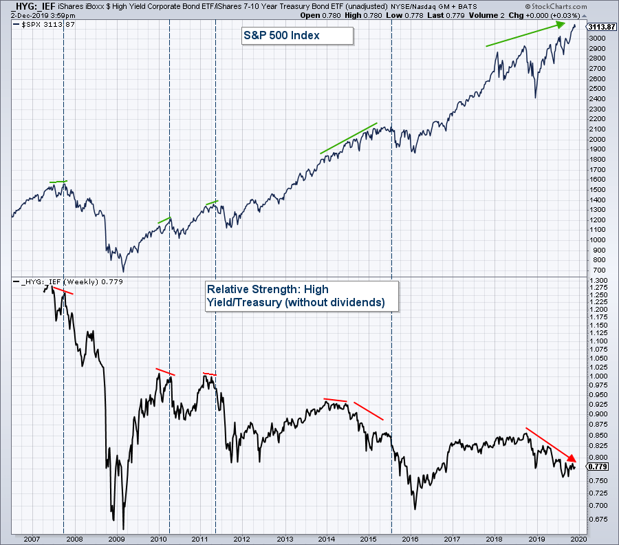
High Yield Bond/Treasury Bond Relative Strength
Below is another relative strength chart. This one charts the relative strength of High Yield Bonds (risk-on) relative to Treasury Bonds (risk-off). I have used vertical blue lines to make it easier to see major stock market tops. Red and green lines note periods of negative divergence.
Notice how past stock market tops have been preceded by negative divergences in this relative strength chart in the lower panel. Now, look at how this chart has been diverging negatively with the Index for about the past year. The fact that Treasury Bonds have been outperforming High Yield Bonds for the past year is a warning sign.
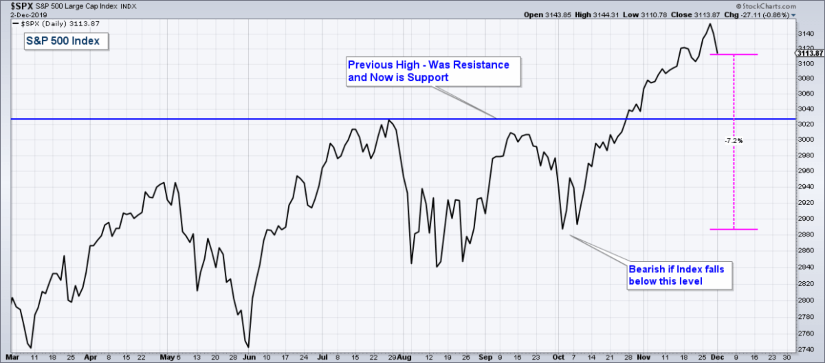
All the charts above are warning signs, not signals. The stock market is still in an uptrend. However, if the S&P 500 (chart below) falls below the October lows (a drop of about 7.2% from current levels), then we no longer have a series of higher-lows, putting the uptrend into question.
This would have very bearish implications given all the negative internals that I have presented, the fact that we are in one of the longest bull markets in history, and bond yields recently inverted.
Summary
The longer-term direction of the market will be determined by the future strength or weakness of the economy. If the current period of economic weakness has ended and the economy is entering a renewed period of expansion, then the stock market should advance strongly going forward. On the other hand, if the economy continues to weaken and enters a recession, then stocks are going to fall hard.
Understanding risk is important because markets can fall a lot faster and quicker than they rise.
Client Account Update
Our client accounts are allocated defensively
Client accounts are mainly allocated in Bonds and Money Market funds.
I have erred on the side of caution given the amount of risk that I am detecting in the market. Each day we get a new set of data points, and thus my analysis is dynamic. If market conditions improve I will strategically add equity positions.
Now is the time to reevaluate your retirement account allocations, not later after you have incurred substantial losses.
If you are worried about how your retirement accounts are allocated, shoot me an email and we can schedule a virtual meeting to review your holdings and investment strategy.

Craig Thompson, ChFC
Email: [email protected]
Phone: 619-709-0066
Asset Solutions Advisory Services, Inc. is a Fee-Only Registered Investment Advisor specializing in helping the needs of retirees, those nearing retirement, and other investors with similar investment goals.
We are an “active” money manager that looks to generate steady long-term returns, while protecting clients from large losses during major market corrections.
Asset Solutions may discuss and display, charts, graphs, formulas which are not intended to be used by themselves to determine which securities to buy or sell, or when to buy or sell them. Such charts and graphs offer limited information and should not be used on their own to make investment decisions. Most data and charts are provided by www.stockcharts.com.
Asset Solutions is a registered investment adviser. Information presented is for educational purposes only and does not intend to make an offer or solicitation for the sale or purchase of any specific securities, investments, or investment strategies. Investments involve risk and unless otherwise stated, are not guaranteed. Be sure to first consult with a qualified financial adviser and/or tax professional before implementing any strategy discussed herein. Past performance is not indicative of future performance.